← All case studies
HouseTipster
·
Web
·
2025
HouseTipster
Transformed a home DIY blog into a thriving e-commerce platform: 40% increase in engagement and 20% fewer support tickets.
HouseTipster — E-commerce
Web
The 30-second version
0:30 read
Role
Lead UX/UI Designer
Team
E-commerce & B2C
Timeline
Desktop, Responsive Mobile
Platform
Web
Problem
Readers fell in love with products in our articles, then hit a wall. There was no way to buy. That excitement turned to frustration as they left to search elsewhere. We weren’t just losing sales; we were losing trust. The challenge was to turn inspiration into immediate purchase, modernize a dated UI, simplify checkout, and protect the site’s editorial identity.
+40%
overall user engagement
40 pts
reduction in cart abandonment
−20%
support tickets
01 Context
Overview
HouseTipster began as a popular interior design blog with a highly engaged and loyal audience. However, it lacked the fundamental infrastructure to monetize that traffic effectively. While readers visited daily for inspiration, the platform remained a content-only site, leaving substantial revenue on the table.
The mission was clear: evolve this editorial destination into a full-scale, zero-to-one e-commerce platform without alienating the existing readership.
Solution
I bridged the gap between inspiration and purchase by creating a seamless, task-focused shopping experience integrated directly into the editorial flow. As Lead UX/UI Designer, I drove the transformation from the ground up across desktop and responsive mobile platforms.
This zero-to-one initiative required balancing ambitious business goals with delicate stakeholder dynamics. By prioritizing a responsive, multi-device strategy and modernizing a dated interface, we aimed to turn passive readers into active, returning customers.
Before
A blog-first site with scattered articles and no way to purchase products. Confusing navigation, desktop-only optimization, and no trust signals like reviews or ratings.

After
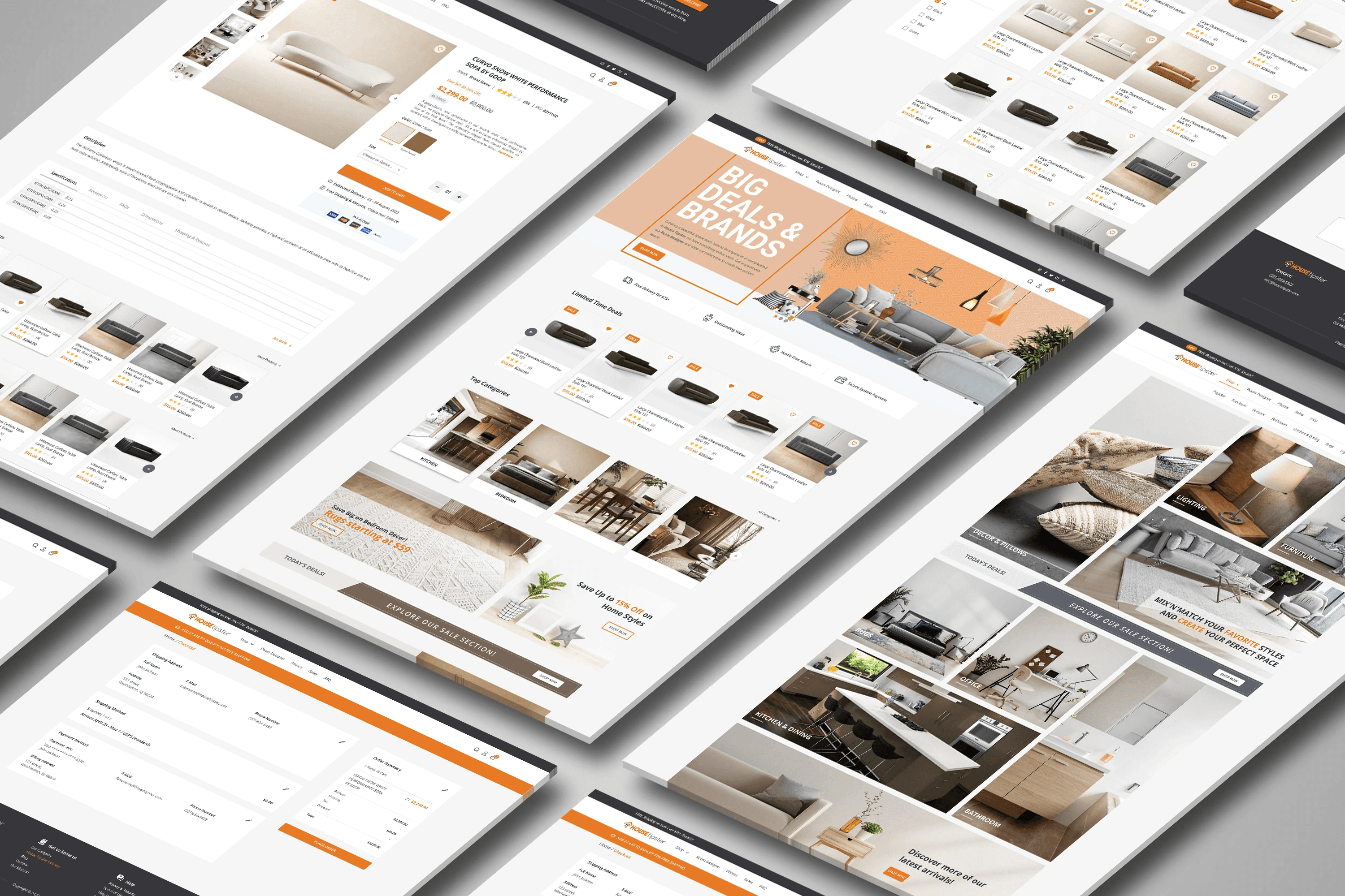
An integrated platform with clear shopping features, a streamlined 2-step checkout, product categories and featured items on the homepage, mobile-optimized responsive design, and reviews and trust signals throughout.

02 Research
Discovery & Ambiguity: The Friction of Inspiration
Early in discovery, the core problem became painfully obvious: readers fell in love with products featured in our articles, but there was no direct way to buy them. Initial excitement soured into frustration as users left our ecosystem to search elsewhere.

The legacy interface was heavily blog-first, with scattered articles and confusing, desktop-only navigation. There were no trust signals, no reviews, and no clear pathways to conversion, resulting in a stagnant 35% engagement rate and a modest 15% returning customer rate.
I mapped the points of failure in the user journey to understand where inspiration died and abandonment began. The mandate was to turn inspiration into immediate purchase, modernize the UI, and simplify checkout while protecting the brand’s editorial identity.

Finding Signal: The Competitive Gap
I conducted a competitive analysis of Wayfair, Houzz, and IKEA to understand how established players handled the intersection of content and commerce. Most competitors leaned too far in one direction: clinical, commerce-only product grids or overwhelming marketplaces that fatigued users with endless options. Neither nurtured the user’s initial spark of creativity.

HouseTipster’s unique edge was its established editorial authority. Our strategy was to lead with inspiration through content and seamlessly follow with frictionless purchase. We needed to compete on curated context, not sheer volume.

03 Decisions
First Principles Design: Building the Foundation
With a clear strategy, I mapped a logical, linear task flow that removed the friction points identified during discovery. I charted the user’s path from the homepage through category selection and item details, then to the cart and confirmation.

Homepage Strategy
The new homepage used e-commerce best practices to build immediate trust.
Building the Design System
Bolting a store onto a blog would feel disjointed, so I created a lightweight design system from scratch. It established a typography scale from h1 to h6, a unified palette using the primary brand orange and functional neutrals, and standardized UI components.
Standardizing dropdown selects, buttons, and responsive navigation for desktop, tablet, and mobile allowed us to move rapidly into high-fidelity design. The transition from reading a blog post to browsing a product catalog felt like a single, unified brand experience.

Features
1. Featured Limited-Edition Catalog

2. Strategic Sales Highlights

3. Integrated Trust Signals

4. Streamlined 2-Step Checkout

04 Result
Traction & Growth: Delivering Impact
The redesigned HouseTipster platform transformed a passive blog into a credible retail destination. The quantitative results validated our design decisions: a 40-point reduction in cart abandonment, a 40% increase in overall engagement, and 20% fewer support tickets.
The streamlined 2-step checkout removed complex forms so users could act on inspiration instantly. Integrating shopping into the editorial flow helped readers transition smoothly from guides to products.
Trust signals and a professional, responsive UI improved customer loyalty. The returning customer rate increased from 15% to 20%, showing that readers now viewed the site as a reliable store. Clear navigation and intuitive design also supported a more self-serve experience.
Learnings & Stakeholder Management
Building this 0→1 e-commerce experience taught me that successful product design requires strategic diplomacy, not just high-fidelity prototypes. Balancing the business mandate for revenue with the editorial team’s protective stance over its content was the most challenging and rewarding part of the project.
I learned the power of data-driven defense. When opinions clash, heatmaps and usability test results provide an objective common language. They shifted the conversation from what we like to what our users need and helped secure buy-in before wireframing.
“This project completely changed how I approach stakeholder management. Data isn’t just for measuring success post-launch; it’s the tool you use to secure buy-in before you ever draw a wireframe.” — Kevin Perdomo, Lead UX/UI Designer

Desktop prototype

Mobile prototype
Next
More case studies.


All case studies →